To summarize many of the features that can be applied to a product in your catalog, let’s look at a sample product details page created by ProductCart (technically, the file is called
pc/viewPrd.asp).
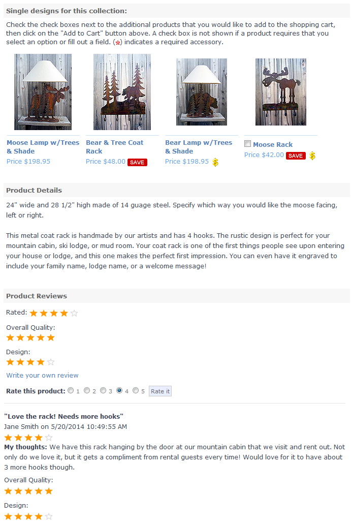
Scrolling down on the page will take you to more details. See the following image that continues on the "Moose & Tree Coat Rack" example.
If you'd like to adjust the order or the arrangement of the default product details page, you can easily do so in ProductCart. Your product details page can now be customized in an unlimited number of ways using the Drag & Drop Reordering feature and Tabbed Display. Instructions on how to customize this page can be found in the Customizable Product Detail Page article within this support base.
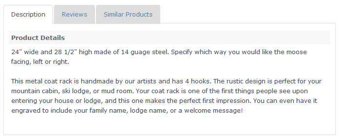
One of the main advantages to customizing your product detail page is the use of Tabbed Display. This feature can shorten the product display page into easy-to-navigate tabs of your choice. Check out the following image to see what the bottom half of the Product Details page for the "Moose & Tree Coat Rack" would look like if you arranged the same information into simple Tabbed Display. It easily condenses the long details section (second image above) into a tabbed box:
Again, the possibilities with the Customizable Product Detail Page are endless! It's up to you to decide how you want your product detail pages to look.
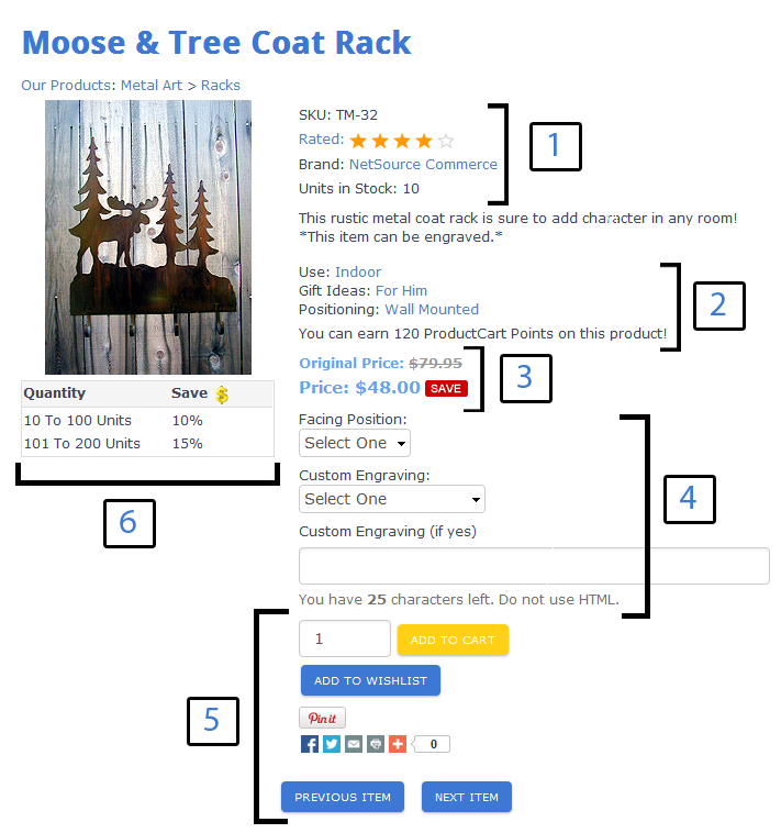
Default Product Details Display
- Starting from the top, you will notice the product name, the part number (SKU), the brand (if a brand has been assigned - this links to a page showing all other products assigned to the same brand), and the current inventory level. Then the short product description is shown.
- Below the short product description are the custom search fields that were assigned to this product. As mentioned before, there can be up to three custom search fields assigned to a product. In this case, they are: Use, Gift Ideas, and Positioning. This allows customers to search the store using those filters on the advanced search page.
The Reward Points that can be accrued when purchasing this product are shown next. In this fictitious store, Reward Points were renamed ProductCart Points, and the feature was turned on (when off, points are not shown on the product details page, and they are not accrued).
- Pricing information is shown below Reward Points. This product was set to show the Original Price and the Sale Price.
- Below the price are product options (in this case: Facing Position), which may or may not affect the price (in the example shown, the facing position does not affect the price, but selecting a "Back" or "Front" engraving will add $10). If your product has custom input text fields, they are displayed below this (in the example, this is where the customer would type the message they wish to be engraved).
- The bottom part of the page displays:
- The quantity field as well as the "Add to Cart" and "Add to Wish List" buttons.
- The "Pin it" button that allows customers to pin the product to their Pinterest board
- Social media icon links that allow customers to post the product to their social media platforms
- "Previous Item" and "Next Item" buttons
- On the left side of the page is the product image. Hovering over the product image will produce a zoom cursor, and clicking will link to the detail view image (shown only if a detail view image has been specified for the product). Quantity discounts are displayed below the image (shown only if quantity discounts apply to the selected product).
Scrolling down on the page will take you to more details. See the following image that continues on the "Moose & Tree Coat Rack" example.
- Cross selling products, if the feature has been turned on. Even if the product is out of stock or not for sale (quantity field and related buttons are not shown), cross selling products are still displayed.
- The long product description.
- Product reviews, if the feature has been turned on.
Custom Product Details Display: Drag & Drop and Tabs
If you'd like to adjust the order or the arrangement of the default product details page, you can easily do so in ProductCart. Your product details page can now be customized in an unlimited number of ways using the Drag & Drop Reordering feature and Tabbed Display. Instructions on how to customize this page can be found in the Customizable Product Detail Page article within this support base.
One of the main advantages to customizing your product detail page is the use of Tabbed Display. This feature can shorten the product display page into easy-to-navigate tabs of your choice. Check out the following image to see what the bottom half of the Product Details page for the "Moose & Tree Coat Rack" would look like if you arranged the same information into simple Tabbed Display. It easily condenses the long details section (second image above) into a tabbed box:
Again, the possibilities with the Customizable Product Detail Page are endless! It's up to you to decide how you want your product detail pages to look.