Slideshow for Mobile
ProductCart includes a
Home Page Slideshow that can be managed via your
Control Panel. The slideshow is responsive, meaning that it will automatically resize as its containing element resizes. This allows you to use the same exact slideshow on both your Standard Home Page and your Mobile Home Page if you choose. However, we recommend customizing your Mobile Slideshow, for optimum display and results.
Click on the " Mobile" tab. At the very top of the page you'll see a checkbox to " Use Desktop Settings" which will allow you to share same slides and settings between your Mobile and Standard Desktop sites.


Slide Dimensions - Set the width and height of the slideshow here. The dimensions you set here will set the upper size limit for your slide images as well as the aspect ratio. All slide images that you upload will be resized to these dimensions and the aspect ratio will be locked. However, since the slideshow is responsive, the slides will resize depending on the screen resolution of the device accessing your site. We recommend an upper width of 550 pixels.
If you have uploaded slides already and change the dimensions here, you will be alerted to the slides that you need to re-upload. Simply click the "Re-Upload" link to update the slide.
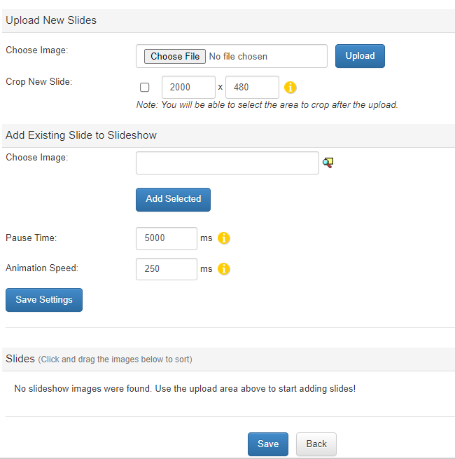
Pause Time - This is the amount of time the slideshow will "pause" on an individual slide. If you have added text to your images you will want to make sure this time is large enough for your visit to read completely. Note: 5000 ms translates to 5 seconds.
Animation Speed - This number refers to the time taken between the slides for your transitions. To completely disable transition animations, set this field to 0.
Slides - Under the "Slides" section, you can "drag-and-drop" the order of the slides, delete any give slide, or add captions, alt text, URL link and display dates.

Option 1: Using the Standard Slideshow on Your Mobile Site
To manage your Home Page Slideshow, go to the Settings menu, choose Images and Navigation, and then Upload Slideshow Images.Click on the " Mobile" tab. At the very top of the page you'll see a checkbox to " Use Desktop Settings" which will allow you to share same slides and settings between your Mobile and Standard Desktop sites.

Option 2: Managing a Separate Mobile Slideshow
If you'd prefer to manage a separate slideshow for your mobile visitors which is optimized for display on smaller screens (recommended), make sure " Use Desktop Settings" is un-checked.Manage Mobile Slide Settings

Slide Dimensions - Set the width and height of the slideshow here. The dimensions you set here will set the upper size limit for your slide images as well as the aspect ratio. All slide images that you upload will be resized to these dimensions and the aspect ratio will be locked. However, since the slideshow is responsive, the slides will resize depending on the screen resolution of the device accessing your site. We recommend an upper width of 550 pixels.
If you have uploaded slides already and change the dimensions here, you will be alerted to the slides that you need to re-upload. Simply click the "Re-Upload" link to update the slide.
Pause Time - This is the amount of time the slideshow will "pause" on an individual slide. If you have added text to your images you will want to make sure this time is large enough for your visit to read completely. Note: 5000 ms translates to 5 seconds.
Animation Speed - This number refers to the time taken between the slides for your transitions. To completely disable transition animations, set this field to 0.
Slides - Under the "Slides" section, you can "drag-and-drop" the order of the slides, delete any give slide, or add captions, alt text, URL link and display dates.

